There are some people who learn things the easy way. I am not one of those. If there is a hard way to do something I am guaranteed to discover it. This 9"x12" canvas was done over the course of seven, three hour poses. When I started the picture I had always planned to do a drawing and then transfer it to a canvas. So why did I decide to do a half length figure on 18"x24" paper, that took me four sessions to complete? See above. When I realized that there was no way I was going to come anywhere near completing a painting that size I decided to photoshop it down and use a smaller canvas. It was still going to be close. I didn't really care if I finished it or not, I wanted to learn things, not paint a pretty painting. Today when I got to the session I had the head and right shoulder painted in and that was it. I decided to go for broke and paint like someone was holding a gun to my head saying "finish or else". Why, I don't really know, I had a feeling that I would get more out of it even if the rest of the painting was only roughed in, at least I would be dealing with the figure in it's totality. Some things made it a little easier. One was that I pre- mixed and tubed a flesh string, three darks and three lights. Ideally, I should have mixed the string while looking at the model but there wasn't going to be time for that. I used a Jacob Collins painting of "Carolina" that was in Classical Painting Atelier, kind of like a Munsell scale. I mixed the colors and matched them to the reproduction. I thought that the painting had a similar skin color and lighting to the one that I was working on. I kept the palette limited to Zorn's of Flake white, Cad Red Light, Yellow Ochre, and Ivory Black. I used raw umber and ochre for some of the half tones. I'm glad that I still have a lot left because I plan to use it at my figure drawing groups sessions.All in all, it was a lot of fun and the Long Island Academy of Fine art is a great place to paint and learn.
Wednesday, August 26, 2009
Monday, August 24, 2009
More Rope
I'm making progress, slow but steady. My approach to chiaroscuro may be a little different from some. I don't squint away pieces of the form and deal with the parts illuminated by light. I prefer to paint up to the edge placing a dark value next to a dark value and in that way I can achieve a dissapearing edge effect without losing the shadow color. I don't rub the edges together with a fan brush or try to blend them, I let the values merge of their own accord. I have a mistrust of certain effects that I see abused in the work of so many painters that I try to stear clear of any mannerist tendencies. I'm not saying one way is neccessarily better, it's just my own personal preference.
Saturday, August 22, 2009
"More Rope"
I'm just about finished with the rope. The hard part of the rope for me was getting it to look all of a piece, rather than a stack of forms. It's kind of like when you're drawing the figure and you look for forms within forms that link up one muscle with another, so they don't have that disjointed look. Their are little "light bridges " that connect one section of rope to another, they are just very hard to discern. Especially on an old rope that's got an oily patina that plays all kinds od optical tricks. For the most part I feel like I was on the form, but I won't be surprised if I have to go back in and do a little tinkering.
Thursday, August 20, 2009
Rope and Poster
The poster is on a small 5"x7" canvas board. If you've never tried using a poster study, I highly recommend it. It takes a lot of guesswork out of the process, especially if you don't use a colored underpainting. The rope in the painting (11"x14") isn't quite as dark as it appears here, it's a little closer in value to the poster study. It's just one of those digital camera glitches, every once in a while you come across a set of colors that the camera refuses to see accurately. It'll probably come up lighter when I paint more of the background. Painting the rope is a lot of fun. It's like painting a minituarized version of Van Gogh's hay fields. I've also been thinking about Leonardo's awesome knot mural, that covers an entire ceiling with one strand looped into intricate configurations. The arrangement is inspired by Luis Melendez. I like the way that the objects in his vertical compositions kind of diminish into the background.
Tuesday, August 18, 2009
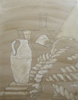
"Jug and Rope"
The people in the suburban town where I live are not too friendly. As I go along on my daily run I will generally say hello or wave. A lot of the time I get no reaction or the people turn away before I get a chance. I know it's not me because as soon as I cross the town line people are waving, asking how I'm doing, smiling, etc; My theory is that most of the people in my town, grew up there; they bought their parents house, or moved onto the same block, and anyone else is considered an outsider. I ended up moving here because my wife grew up here and wanted to move back. There are a few exceptions. One of them was this elderly gentleman a few blocks down who always seemed glad to see me in all of the six years that I've been in the neighborhood. I noticed in the last few years that he was wheelchair bound and his daughter came to live with him, I guess to take care of him. She seemed a little out of sorts, she reminded me of Little Edie from Grey Gardens. After a while I didn't see the old fellow and I guess he must have passed on, because little by little I started to see things put out on the curb that must have been his. The last time I spoke to him he jumped up out of his chair and said "it's good to see you, I've been watching you run past my house for twenty five years!" So I guess he was going a little senile. I was running past his house a few months ago when I saw this rope sticking out of the pile, I thought it would be interesting to paint, so I ran home with it. My neighbors are used to seeing me come running back with stuff; once I came running back carrying a couple of old saw horses that I used to make a bench. As I was drawing the rope I started to think what this fellow's life must have been like and how the rope had been worn smooth with use and how it must have calloused his hands as he used it to tie his boat or tow something or whatever. I guess he died the way most of us would want to go, in his own home, not in a hospital. I'm not the type of painter to do themed still lifes. I generally respond to light and color and form, and this one isn't any different. It's not a vanitas or memorial. It's just that I kind of miss seeing the old dude on my daily runs and I thought a little about him while I was working on this painting. Anyways, this ones for you, old timer, I hope you like it.
Labels:
block-in,
ebauche,
shawn sullivan,
still life,
underpainting
"Watermelon Slices" Completed
The black plate is placed on a piece of firewood that I brought home from my camping trip. I was throwing wood on the fire when I was about to throw this one on but then I looked at it and unlike the other pieces it was a square block and I thought "hmm, that might be good for a painting" so I brought it home. When we arrived at the campground the people across from us had some kind of family reunion going on, they had eight adjoining sights. They were leaving the next day so they gave us their remaining firewood, which was more than I could burn in a week if I kept the fire going all day. Usually our firewood supply barely manages to last the trip. Now that I had an unlimited supply, it rained almost every evening, except our last night when we had quite a bonfire going and still left quite a bit for the next campers. Anyways, I guess this painting is kind of an "ode" to summer with the watermelon, firewood, and black dinnerware.
Labels:
ebauche,
shawn sullivan,
still life,
window shade technique
Sunday, August 16, 2009
"Watermelon Slices"
I dispensed with my usual procedure on this one(8"x10", oil on linen), because I was worried that the melon would lose its color after the first day. So I laid the design out using vine charcoal and a small synthetic bright for erasing and refining the contours. Then I inked the drawing in. Next I washed in the background and other objects, leaving the watermelon untouched. After mixing my color strings I just went for it. I'm glad I got it mostly completed on the first pass because I don't know if I could have mixed those exact colors again, I was going on pure instinct. It's funny, because I had this one painted in my head before I'd even bought the watermelon or black plate. Sometimes it just goes like that. I've been looking at the paintings of Luis Melendez a lot lately and that's probably where I got the idea of the black plate. I was hoping the melon would be reflected in the plate but it didn't work out that way. Maybe on the next one.
Labels:
alla prima,
ebauche,
shawn sullivan,
still life,
window shade technique
Saturday, August 15, 2009
"Anjou Pears" and "Limone"
After being away for a week on an awesome family camping trip, these two paintings, "Anjou Pears" 11"x14" and "Limone" 16"x20", were dry enough to oil out and do some retouching. I don't use retouch varnish for oiling out. It dries too fast for me and it has a tacky feeling. I prefer to oil out with refined linseed oil mixed with odorless mineral spirits, six parts spirits to four parts oil. I use a sable brush to cover the entire canvas. Then I gently pat it down with a Viva paper towel. The thin coating that's left brings up the colors and makes the painting feel like you're still working wet into wet. I did quite a bit of retouching on these two, I'm never fully satisfied (is anybody ever?). In "Limone" my goal was to have the figures without losing the still life as the center of interest. That's the main reason why the front figure was darkened and the values compressed. I did the same for the green apron because again I felt it was too busy and competing with the lemons. In "Anjou Pears" I worked mainly on the vase and table. I altered the top of the vase. I felt there was too much of that viridian, making it top heavy, and I darkened the shadow area to make the lights fuller. After being away from my easel for a week I was chomping at the bit and I'm glad I was able to wrap these up because I have a new setup in my head that I'm eager to start on.
Saturday, August 8, 2009
Photographing Paintings
I've seen quite a few blog discussions about photographing paintings so I thought I'd jump in with what works for me. I use a nikon coolpix digital camera. No special lens or anything. I tried a lot of different setups; outdoors in the shade, spots at 45 degree angles, white light settings etc;. What finally worked for me is that I discovered that my camera has a setting specifically for photographing art in a museum, low light, setting. In my studio I have a four foot long flourescent overhanging, work table light, about two feet over my easel. I have one warm bulb(pinkish) and one cool bulb. I place the painting directly under the lights, about a foot back from center, with the painting perfectly vertical. I make sure that I have no lights on in the background.(they'll throw the camera off). I have the camera mounted on a tripod. Although I have photoshop to touch up the photos most of the time the photo is already good and I don't need to fiddle with it. If you've been having trouble it might be worth a try.
"Pears Continued"
I got most of the painting blasted in. The seams in the background will dissapear when it's oiled out for retouching. I was having fun with the dialogue between the rose leaves and the painted leaves on the vase. The dark wood table seemed to absorb light like a galactic black hole. In order to figure it out I used a folded piece of paper and held it in position and then used that as a guideline.
Labels:
alla prima,
Form painting,
still life,
window shade technique
Thursday, August 6, 2009
"Still More Pears"
I got the rose in pretty quickly this morning, but the brushed metal bowl drove me crazy. It's not as reflective as smooth metal so you have to follow the form, but it's still metal and the darks and lights range wider than they would on an ordinary bowl. I had to keep pushing down the darks and then I would squint and have to go even darker. I wasn't really concerned with the texture I figured if I got the light right, the texture would appear on it's own.It seems to have worked.Phew! I'm tired.
Tuesday, August 4, 2009
"More Pears"
These pears were literally changing color as I painted them. I don't know if it's the humidity or what, but I had to hussle them in before they turned completely brown. I suppose I could have bought more but I was locked in to this specific group. By the time I go into the studio tomorrow they'll probably be black but that's okay, at this point I can safely bring in the "stunt" pears.
Monday, August 3, 2009
"Pears and Rose"
11"x14" on stretched linen. Hopefully the wipeout will be dry by tomorrow so I can get started on those yellow-greenish anjou pears before they lose their freshness. I have the canvas sitting out in the sun (finally no rain) and that usually works pretty well. The table is one of those old flip up sewing machine tables with a really dark awesome wood patina that my wife found on the curb while trolling the neighborhood. It weighed about a ton so I detached the sewing machine and threw it out, which probably decreased it's value as an antique, but I don't care I just want to paint it, not bring it on the Antiques Road Show!
Labels:
block-in,
ebauche,
shawn sullivan,
still life,
underpainting
Saturday, August 1, 2009
"Stuffed Shirts"
I'm really having to keep my wits about me while painting these shirts. I think this is the most cloth I've ever painted in a single painting. It's good practice and I'm learning as I go so hopefully the next one will go a little smoother. The hardest part is judging the relative value of a given area, because surprisingly enough, my perception of it is going to change as I go along (or maybe not surprising). The other problem is that I have an image in my mind of what I want the painting to look like that doesn't necessarily correspond with what I'm seeing. I need to work from the object to get the "gravitas" I desire but if I copied it exactly as I'm seeing it, it would fall short of my goal. Hope that makes sense.
Labels:
compressed values,
Form painting,
grisaille,
shawn sullivan
Subscribe to:
Posts (Atom)