Showing posts with label ebauche. Show all posts

Wednesday, March 1, 2017

Get Your Yah Yahs Out

As a fairly traditional, I guess "academic" painter, the methods that I use can sometimes seem restricting and methodical. Don't get me wrong, I'm happy most of the time with the results. It's just that sometimes you get the urge to paint thickly and broadly; you want to slash the paint on like the Van Gogh demon you've always secretly wanted to be. It took me a long time to come to terms with the fact that I'm not in the Sargent-Sorolla-Zorn mode of painting. If you listen real hard to your inner voice, not to be confused with schizo like paranoia, you can figure out that there's a reason that you gravitated to a particular way of painting. Carefully applying paint to a fully mapped out drawing using a carefully mixed palette of values and colors suits me. That's just how it is, and I'm okay with it. I do however, enjoy dabbling in other methods, ones that I have no intention of selling, pressure free slathering, maybe the way that art is occasionally supposed to be.
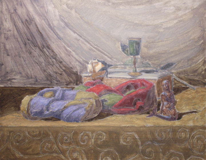
       The "poster" study gives me a chance to step outside of my comfort zone. The idea behind it is to make a miniature version of the painting your about to start. I usually do mine on 6"x8" cheapo canvas boards. I don't want to start thinking of them as precious "masterpieces" because, as I previously stated, the idea is to have some fun, while also figuring out some things that might help me to make a better painting. I'm not about capturing the setup exactly as it appears. Maybe I have a God complex, my wife would say "no maybe's about it!", but I want to arrange the values and colors to capture the inner vision that sparked the idea of the painting in the first place. Right now I'm working a little bit in "back to the future" mode, because I'm making the poster study after already having transferred the final drawing to a larger canvas. What I really should be doing is making several poster studies, trying out a few arrangements, before I start the finished drawing and transfer. This is how the study was traditionally used and it makes a lot of sense. The problem is that in today's world it's just so danged easy to snap a photo of the finished drawing, print it out at 6 x 8 and make a quick poster. I'm at the point in my development now where I need to slow down and do things that will help me get off of this plateau and onto the next level. Spending more time on studies seems like the best way to get there.
  In the picture above you can see the poster study and grisaille umber wipe out for my current painting "Gloria Mundi". I decided to limit the poster study to no more than three values for each area. I don't blend the paint, I lay it down in separate value and color patches. I'm looking for the "abstract" quality of the painting as well as composition, color, and tone. I'm not trying to make "art". I love these little color studies but clearly they are an acquired taste. I once had a bunch of them at a solo show, priced very reasonably so that the less wealthy, or as I like to call them "cheapskates" could buy an affordable piece of art; really affordable, as in dirt cheap! I couldn't give them away. Not even one. I guess that's a good thing, because if I start to think of them as too precious, I probably wouldn't be dancing around my studio, blasting "Purple Haze", and letting down what hair I have left!

Saturday, July 30, 2016

"Admiration" Process and Progress Shots

                Recently I read an article by an artist who was wondering if it's a mistake for artists to post work in progress shots of their artwork. His feeling was that it was somehow taking away some of the mystery of the work and possibly devaluing it by too much exposure. I'm not necessarily the biggest fan of the social media age, but one of the best things to come of all of this, is the glimpse into the studios and working habits of artists that I admire but will never get a chance to meet. I was able to introduce my work and get accepted into a new gallery, and this came about entirely through social media. So here's a look into the creation of one of my latest, "Admiration", oil on panel, 16" x 20".
               My initial concept for this painting was to show how our vision and perceptions of the world around us has been filtered through technology and how eventually we have to bring it back to looking at nature if we want to remove the scales from our eyes. How many times will a realist painter have to hear the compliment that it looks just like a photograph, when what they should be hearing is that it looks perfectly natural! I wanted to paint this one using daylight to add another "natural" element to my concept. Once I had set up the vase of flowers with the wooden bowl, I began to look for other circular forms and shapes to add to the composition. I had recently been talking with some students about the apocryphal story of how Giotto submitted a drawing of a circle to the Pope when he asked for a sample of his work, and how Rembrandt included two circles in the background of his self portrait, as if to say "I'm twice as good as Giotto". Once I added the wooden pulley, and silver bowl, the painting really began to take on a mind of it's own (yes sometimes that really does happen, it's not just artist b.s.) I start my making a careful drawing on paper, sized to the canvas, which I transfer using conte crayon on the back of the drawing. I used to save every drawing that I made, thinking I would need them for the eventual retrospective I was going to have, but my studio is small and I just can't store them, so now I use the originals and don't have to deal with the idiots at the copy center. Here's a shot of the transfer with a wipeout using thinned down raw umber. My wipeouts are kept fairly simple; two values. My theory is that if the painting doesn't grab me with a two value structure, it's not going to grab me with twenty.
                My next step is to make a color wash. Most artists thin their paint way down so that it appears almost like a watercolor. I put my paint on thin, but more opaque than a watercolor. I try to get it as much "like" in the color wash pass as I can, so that I can get it even more "like" in the finishing pass. I got this idea from reading Solomon J. Solomon and a workshop I took with Douglas Flynt. I used to make color studies for each painting, and I probably still should, but I've got a lot of ideas in my head, and I'm no "spring chicken" if you get my drift. I paint the color wash very carefully moving from form to form, usually starting with the center of interest and fanning out form there. Here's a shot of the color wash in progress.
          Once the color wash is dry it's time for deja-vu all over again (thanks Yogi Berra). I repaint every part of the painting exactly as I did it the first time, except now I'm noticing some things I didn't pick up on before, and I'm thickening up the lights a bit. My goal is to stay with each form, in a Zen like manner, until I'm completely satisfied, working wet into wet. I don't leave myself a back door option of fixing it later. I will occasionally repaint an area, but I never find it to be as satisfying as getting it right the first time. It loses some of the freshness and snappy brush work! I've always worked this way, even before studying at an atelier, and just assumed I was doing it wrong. Now I  don't care, this is how I paint, take it or leave it. Below is a shot of the final painting. This is one of those rare instances where the painting comes close to my initial concept. Let's face it, no painting is ever going to be as vivid as that initial bolt of lightning when an idea just pops into your head and you see it clear as day for one fleeting second. I guess that's the windmill that keeps me coming back.


Friday, May 27, 2016

The Hard Way


      Recently, I've been working on a series of paintings where I complete two paintings, one an 8" x 10", and the other, a 16" x 20", based on the same setup, simultaneously. The first couple that I did, my process was to make a drawing for the 8x10 and then bring it to FedEx to have it enlarged. It was a little tricky at first, but they figured out how to do it. The last painting that I just completed, "Melon Boat", their machine was down, When it's "go time" I can't wait, so I went home and gridded the drawing, and enlarged it the old fashioned way. It's obviously a lot more work and time, and time is money, so for my latest one (see above), I decided to give FedEx another try. I went with my 8x10 drawing, and explained that I would like one copy to be the same exact size, and one copy to be twice as big, 16"x20". Now I'm not a techno, but this doesn't seem to me to be overly complicated. I always bring a tape measure with me to make sure I don't leave with a wrong size image. The manager first made the one to one copy, it was a half inch smaller. Then she attempted the enlargement. It was an inch smaller, and all of the lines were scrambled and pixelated. She then proceeded to lecture me on why it was my fault for asking for something that was impossible, even though I explained to her that I'd had it done there before.
   I didn't get into an argument with her, I kept my cool, and drove back home empty handed. I try to be aware sometimes when the universe is trying to teach me an important lesson. I gridded up my drawing and proceeded to enlarge it the hard way, one square at a time. What I did was to setup two easels side by side, both facing the still life, and I made the block-in from the drawing, but I did the finished line work on the larger piece from direct observation of the setup. What I noticed was that as I made the enlarged drawing, I was picking up on some subtleties that had eluded me in the smaller piece, and actually might have been distracting in the smaller work. My original idea for doing these enlargements was to highlight some of the things that I do on the smaller pieces, and also to be able to push my brushwork a bit more. After doing the large drawing I transferred it to a canvas by rubbing the back with conte crayon, and tracing over the lines. I then did a very basic wipe out by covering the canvas with thinned down raw umber, and pulled out the lights with a paper towel. Some artists do a very developed and modeled wipe out, my philosophy is that if it doesn't look good with two simple value separations, it's not going to look good with five. My next step will be to add a thinned down color wash using Liquin, where I will paint each form up to as much of a finish as I can achieve with thinned down paint. Check out Doug Flynt's video (highly recommended) at www.douglasflynt.com for a good demonstration of this process. So Thanks FedEx for screwing up, you gave me the kick in the behind that I was needing!

Thursday, July 9, 2015

More Poms

 I've gotten a bit further on the small painting "Pomegranate, Canoe, and Box" oil on panel, 8"x10". My usual method when painting fruit is to do a raw umber wipeout and then do a color wash underpainting (ebauche) focusing on the fruit because that's the perishable. I use Liquin for the ebauche, it gives the paint a nice semi glossy transparency and it dries quickly. The photo below shows the completion of the next stage. I start the finishing pass by first laying a couche (thin coating) of my medium (Gamblin Neo-Megilp), which is a modern substitute for Maroger medium (black oil). I mix up my neutral string of colors and my color specific strings and I begin to lay in my block-in adding medium as I go. I usually pick one area that includes a large range of hue, value, and chroma and bring it to completion in order to key the painting. Once I've blocked in that area I'll go back in with "bridge" values and colors so that the larger areas will have smoother transitions, and yet still show some brush strokes, what Ted Seth Jacobs calls "shaping the light". Even though I have a string of colors mixed I'm still doing a lot of improvising with my brush, it's not "paint by numbers" by any means.
       I'm teaching an art class at the Brooklyn Museum of Art to teenagers, which is fun, because they want you to focus on a current exhibit along with your art project. Even though my work could be classified as "academic" that doesn't mean I'm not open to other types of art, as they say "variety is the spice of life". Occasionally I'll get to incorporate some of my own methodologies into what I'm teaching. I'm also starting to teach an adult still life class this Monday at the National Art League nationalartleague.org . I've got seven students signed up so far, so I'm excited. It's a lot of work preparing, I have to construct seven shadow boxes, and lighting setups. I want to focus on working from life because I feel that that's the best way to learn.
  You can see in this snap with my phone that I've painted the pomegranate and canoe up to a finish. I usually do a bit of the background because I want to work the edges while the paint is still wet, and it also makes it easier to judge your value relationships.

Wednesday, July 1, 2015

Pomegranates

I love painting pomegranates, but I haven't done one in quite some time. There's something about the grittiness and those dusky sunset reds that I find very appealing. The two pics below show the start. I transferred a carefully made pencil drawing to gessoboard and then I did a wipe out using raw umber. The next day I began a thin color wash underpainting starting with the pomegranate. I always enjoy painting something that requires me to use several hues of the same color. In this case I used permanent alizarin crimson, cadmium red deep, cadmium red medium, and cadmium red light. I generally mix out several strings of color, including a neutral string, before I start to paint. This is a pretty small painting, 8" x 10", I'm hoping that the pomegranate will keep it's glorious color long enough for me to paint it. If it doesn't I'll just go out and get another one and use the colors to paint it from memory.

Saturday, May 30, 2015

Some New Directions

Lately, I've been incorporating some elements into my paintings that are made up from my imagination. I've been looking at some of the artists that I admire, Chardin, Vallayer-Acosta, and the Dutch masters. I started to realize that Chardin probably didn't live in a castle with stone walls and Neolithic looking table tops. A lot of that had to be made up. I don't know it for a fact, but it seems to be true. It seems to be part of a tradition that maybe has been lost, where paintings are either pretty straight forward realism or so expressive that they border on Surrealism. I want the imaginative parts of my paintings to be in harmony with the observed parts and to seem as if they could be real. It's been a lot of fun so far, and it's been opening up some new ideas that I hadn't considered before. Here's a couple that feature some imaginative elements.

"Silent Partners" oil on panel, 9"x12", "Texas Rose, and Lemons" oil on panel, 9"x12".

Sunday, January 25, 2015

New Process Shots

Here are a few shots of what I've been working on lately. I'm a bit behind in my scheduled postings because I started a new job and I'm a little overwhelmed.


 The top picture is a portrait in progress "Ashley with Lures" oil on panel, 16"x20". What you're seeing at this stage is the colored underpainting (ebauche) and the eyes painted in up to a finish. It seems like this one is taking forever, but I'm trying not too rush. Ashley is a great model so I can't wait to see it finished.       "Camera with Apples" oil on panel, 8"x10" is finished. I'm doing two small paintings for a small works show. I decided to have some fun and try different lighting, so the two small paintings are lit directly from above, and I'm working with a small spotlight attached to my easel. I almost don't know what the paintings look like until I'm finished, but so far I'm happy with the results and I'll probably do a few more with the same setup.    "Red Onions and Canoe" oil on panel, 8"x10", is the other small painting. It's shown in the underpainting stage except for the onions which are finished. I always paint the perishables first because you don't want them to lose the fresh appearance. It's a risk because you haven't got all of your colors in but it's really the only way to do it.         "Carved Bird, Lion Mask and Bowl" oil on panel, 12"x16", is in the halfway stage. Everything is finished except part of the lion and the background and tablecloth. I had to stop this one to do the small paintings so I can't wait to get back to it because I'm really enjoying painting these animal figurines.

Sunday, October 26, 2014

"Maraschino" (in progress)

"Maraschino" oil on panel, 12"x16". The top half of the painting is mostly done, except for some touch-ups. Because I'm painting in natural light I've only been able to work on this one sporadically. I'm excited about my progress so far. My paintings don't always match the idea that I have in my head, but this one comes pretty close. I used a fishbowl to float the cherries and weighted down the boat with pennies. Then I placed it on a glass filled with pennies also, so the boat wouldn't spin. I'm really inspired by the amazing lengths the artist Teresa N Fischer goes to set up her still lifes, which she chronicles on her blog. Check it out if you haven't already. I'm going to start on the green cloth today, which I can se is going to have to be tempered down a bit. I'll push the colors more towards blue and away from the yellow spectrum. If I could, I would probably only paint in daylight at this point. Daylight bulbs are okay but nothing beats the real thing! Sometimes one medium can lead to changes in your primary medium. I've mysteriously enough, been asked to do a lot of colored pencil demos lately and working on the white ground has influenced me to skip my usual raw umber wash in and begin the underpainting directly with color. I've got two paintings going along those lines. I have this idea that the color will be better, we'll see.

Wednesday, August 13, 2014

Some New Things and Progress Shots

I've got a few things going simultaneously, always a lot easier when I'm of from my day job. I'm still working on a portrait once a week and I'm continuing to work in daylight on some of my still lifes.
"Strawberries, Canoe, and Oranges" oil on panel, 16" x 20". The fruit is completed. Not my usual method but when painting fruit, you can't wait around for the rest of the painting to catch up. You only have a few days before you lose that initial "bloom" that captured your eye in the first place. I've been looking a lot at Chardin (yet again), and I've decided that I kind of like the idea that my paintings clearly spring from that tradition but have a little bit of "magic realism " in them. I always think of that great Chardin painting that's in the met with the cat and the huge orange balanced precariously on top of a silver urn.
"Reveille" oil on panel. 16"x12". I set this one up thinking how great it would be to paint all of these metallic textures, Then a theme suggested itself, that of a wandering soldier ( I have to stop reading "Game of Thrones") Anyway this shows an umber wash in with the beginning of a color pass.
A little more progress on "Phoebe" oil on panel, 9"x12". I hope I'm coming close to capturing the beautiful copper toned quality of her skin. I have to watch that I don't let the paint film get too thin. I have a tendency when I'm really trying hard to capture a subtle turn of not using enough paint so I may have to repaint parts of the cheek and forehead. If this painting goes well I have it in mind to expand the original drawing into a larger painting that incorporates more background. I hope Phoebe is up for it!

Wednesday, July 23, 2014

More "Phoebe"

I'm making good progress on the finishing pass for "Phoebe" oil on linen panel, 9"x12". I'm finding a lot more color in her skin tones now, so I'm breaking out the cad orange, and alizarin crimson. She's on vacation in Jamaica so hopefully she won't come back with too dark of a tan or I'll have to go by what's already painted.

Thursday, April 12, 2012

Red Delicious Study and Ebauche


The study is about 5"x7". Even though I tried not to over model it, I didn't want it to look like a poster. It's surprising how little noodling is required to create form on these little studies. I guess there's a lesson to be learned there. Ebauches, or color washes, can be very frustrating. The thinned down paint just doesn't work the way it normally does and it takes a bit of adjusting. I was looking at the ebauches of Charles Bargue who is one of my artistic heroes, and they really inspired me to stay with the technique until I get the hang of it.


Saturday, April 7, 2012

Prometheus Underpainting

I've completed the underpainting for "Prometheus" (16"x20", oil on board). Things are pretty much going as planned. Painting directly on the white ground has kept the colors a little pale which will work well when I proceed to do the overpainting. I didn't know if I was going to like the lamp, it was a last minute decision to add it in, but now that I see it I think it fits. I'm debating whether or not to oil out before the next pass. I guess I'll try a little bit without it and see how it goes. I'm off and running on a series now and I'm going forward with a take no prisoners attitude.

Sunday, March 11, 2012

Squash Study and Ebauche


The ebauche (color wash), is on a 11"x14" canvas on panel, and the study is on a 9"x12" panel. I decided to do the wash in after doing the color study and realizing how complex the lighting was going to be. I was thinking about starting directly in on the vegetables but I decided to do things the way that I needed to and if I end up having to replace the squash, so be it. With the daylight savings time change, I may end up being able to get a few hours in after work each day, so maybe I'll finish before they spoil. This composition is a little different for me, obviously inspired by some of Jacob Collins' earlier still life paintings, meant more as an homage than a rip-off (hopefully it comes off that way).

Sunday, November 20, 2011

New Faces


"Victoria" oil on linen on board, 8" x 10", "Julia" oil on linen on board, 16" x 20", Victoria was done in three hours with my saturday portrait group. I feel like I nailed it on this one, and now I've got to decide whether or not to work more on it at the next session or start a new one. The biggest concern is that my buddy Carlos isn't sure whether we have one more session with this model or three more. Aargh! Julia is a portrait that I've just started at my home studio. I have her posing facing a north window directly across from my easel. Like I tell my students. right now this painting is in it's ugly phase. Most paintings go through that. If you stick with it eventually it'll come around. I spent about two and a half hours on the block-in and then I started rushing a little at the end in panic mode, never a good idea. But I'm really enjoying the whole daylight painting thing. In fact, I'm going to make it the focus of my still lifes as well. Cheers and Happy Thanksgiving!


Tuesday, August 30, 2011

Turbans, etc;


I've completed work on "Turbans, Mermaid, and Rose" oil on linen, 16"x20". Even with all the careful planning, drawings, posters, wipeout, ebauche, etc; the end result is always something of a surprise, in this case, pleasantly. I decided to do a colored ebauche for "Turban, Dog, and Rose" oil on linen, 11"x14", since I was happy with my last experiment. This painting is strictly daylit and a bit of a challenge to see my palette and colors with the clarity that I'm used to, but i think in the end there will be a payoff. I have one last session with Caesar, 16"x20", so I'm hoping I can finish the legs. If I had hired this model myseld I would completely repaint the picture and consider the first pass a finished ebauche. That's because I'm having a hard time with this linen board and I'm not getting as much paint on in the finishing layer as I prefer. Still, it's an okay sketch, and grist for the mill, as they say.


Thursday, August 18, 2011

More "Turbans, Mermaid, and Rose"

Some people might be wondering what's up with the turbans, if they're symbolic in any way. No, I just like painting cloth and the homemade turbans create interesting juxtapositions of light and color. Also, they are featured quite a bit in the work of artists that I admire such as Bargue, Gerome, Rembrandt, and Vermeer. I like having a model wear one of my home made creations because it involves a bit of role playing and by taking the model outside of their ordinary existence it allows me a glimpse into their real personality which will hopefully make for a better painting.


Tuesday, August 9, 2011

"Turbans..." Ebauche and Color Study


The color study is on a panel about 5"x7". I took a photo of my block-in drawing, printed it, and then used it to make a charcoal transfer. It made it a lot easier to come up with a mini version to use for a color study. The ebauche on the larger painting (16"x20") has a bit of that dead coloring that comes from working over a wipe-out. I prefer it to doing a color ebauche directly on the white canvas because I kind of like that neutrality to guage my colors against when I do my finishing pass (next stage).


Saturday, June 18, 2011

More Ericka


Here's the poster and ebauche for "Ericka as The Wine Seller" 16"x20". The poster photo came out a little glossy because the paint was still wet, but I guess it gives the general idea of what I try to go for in the study. Mainly I want to be able to quickly think of the color scheme as a whole entity and the 5"x7" size allows me to make rapid decisions. I find that this kind of color "gesture" for want of a better term, if done correctly, will carry over into the final piece. On the ebauche (thinned down color layer), I'm painting it in fairly broadly, I don't want to eat the icing before theres a cake. I've been thinking a lot lately about the approach used by the angel academy and I like the idea of a first painting where there's less pressure to nail down all of the detail. I prefer to keep the first layer kind of soupy however because when I start to paint the finishing pass I like some tooth and I like some of the pale underpainting to glow through the top layer.


Sunday, June 12, 2011

The Wine Seller


Here's the completed block-in and underpainting for "The Wine Seller" 16"x20". I'm pretty happy with the way the composition turned out. I've been sketching the arrangement from my imagination for weeks before actually setting the pose and usually there's a big gap between what you imagine and reality, but this one's pretty close. As I was inking the wipeout I was thinking that I was making it too dark, but then when I put the paint on I was having trouble seeing my lines and I started to freak out a little bit, but I stayed calm and eventually the drawing began to emerge. Whew! I've included a lot of fun things to paint when the model's not here so this one should keep me busy for a while.


Saturday, May 28, 2011

Vickie Completed

This is the final appearance of the portrait that I've been working on at GCA with two of my friends Carlos and Bob. I'm pretty happy with it, I feel that I've extended my learning curve on this one. I would have liked a bit more time on the jacket and the underlying forms but oh well, game over. After watching Scott Waddells portrait painting video I'm anxious to do another one and wouldn't you know it I've hired a model to pose for me at my home studio on Saturday. I can't wait, I've already got a concept in mind and i built a modeling stand and ordered another lighting setup from B&H photo. On this one I'm really going to be slow rolling those forms because there's no deadline! Yay!