Showing posts with label academic painting. Show all posts

Wednesday, March 1, 2017

Get Your Yah Yahs Out

As a fairly traditional, I guess "academic" painter, the methods that I use can sometimes seem restricting and methodical. Don't get me wrong, I'm happy most of the time with the results. It's just that sometimes you get the urge to paint thickly and broadly; you want to slash the paint on like the Van Gogh demon you've always secretly wanted to be. It took me a long time to come to terms with the fact that I'm not in the Sargent-Sorolla-Zorn mode of painting. If you listen real hard to your inner voice, not to be confused with schizo like paranoia, you can figure out that there's a reason that you gravitated to a particular way of painting. Carefully applying paint to a fully mapped out drawing using a carefully mixed palette of values and colors suits me. That's just how it is, and I'm okay with it. I do however, enjoy dabbling in other methods, ones that I have no intention of selling, pressure free slathering, maybe the way that art is occasionally supposed to be.
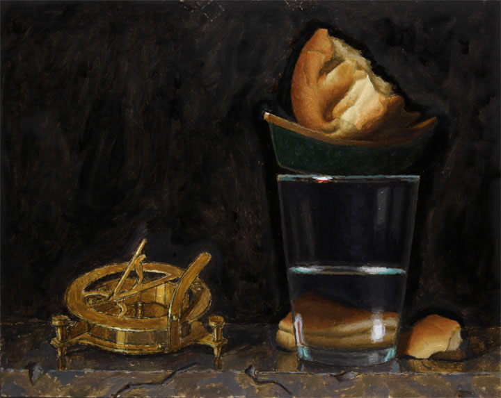
       The "poster" study gives me a chance to step outside of my comfort zone. The idea behind it is to make a miniature version of the painting your about to start. I usually do mine on 6"x8" cheapo canvas boards. I don't want to start thinking of them as precious "masterpieces" because, as I previously stated, the idea is to have some fun, while also figuring out some things that might help me to make a better painting. I'm not about capturing the setup exactly as it appears. Maybe I have a God complex, my wife would say "no maybe's about it!", but I want to arrange the values and colors to capture the inner vision that sparked the idea of the painting in the first place. Right now I'm working a little bit in "back to the future" mode, because I'm making the poster study after already having transferred the final drawing to a larger canvas. What I really should be doing is making several poster studies, trying out a few arrangements, before I start the finished drawing and transfer. This is how the study was traditionally used and it makes a lot of sense. The problem is that in today's world it's just so danged easy to snap a photo of the finished drawing, print it out at 6 x 8 and make a quick poster. I'm at the point in my development now where I need to slow down and do things that will help me get off of this plateau and onto the next level. Spending more time on studies seems like the best way to get there.
  In the picture above you can see the poster study and grisaille umber wipe out for my current painting "Gloria Mundi". I decided to limit the poster study to no more than three values for each area. I don't blend the paint, I lay it down in separate value and color patches. I'm looking for the "abstract" quality of the painting as well as composition, color, and tone. I'm not trying to make "art". I love these little color studies but clearly they are an acquired taste. I once had a bunch of them at a solo show, priced very reasonably so that the less wealthy, or as I like to call them "cheapskates" could buy an affordable piece of art; really affordable, as in dirt cheap! I couldn't give them away. Not even one. I guess that's a good thing, because if I start to think of them as too precious, I probably wouldn't be dancing around my studio, blasting "Purple Haze", and letting down what hair I have left!

Monday, January 23, 2017

New Year, New Resolve

Ingres is reported to have said that "drawing is the probity of art". My interpretation is that he meant that drawing is truth, and without it a work of art lacks a solid foundation. Whenever I start to feel as if I'm running in place, not advancing as far in my work as I would like, I know that I can go back to the source, drawing, and work my way from there. It's such a simple and basic process, yet profoundly engaging, and often frustrating. My academic training has gotten me away from the "contour line", one shot method, that was emphasized in high school and college, and more towards something fluid; like shaping clay for a sculpture. The nebulous quality of my initial straight line block-in pencil marks, gradually become more refined, and my analytical thought processes undergo a similar refinement. In this way each drawing becomes a new adventure, a self discovery that never seems rote or repetitive.
       With the advent of the new year I've decided to push myself a bit harder on the drawing front. I feel like I haven't fully made use of all that drawing has to offer in terms of advancing my art and so I'm determined to increase my focus. Normally I start a painting by making an actual size drawing, sometimes called a "cartoon", and then transferring it to my canvas. This is done on white sketchpad paper. I do spend quite a bit of time on the drawing, and I keep pushing it until I feel it's "canvas ready". I use a mirror often to check for mistakes, and I do a lot of measuring, and cross measuring. So, what else could I do, one might ask? Usually my painting concept is based on a small thumbnail sketch. I'm going to start making larger, slightly more refined sketches, maybe on toned paper, that include a value study as well. I want to use the drawing as a way of working out several possibilities in each arrangement that I set up, so as to arrive at the best solution. I also want to make individual studies of elements in the setup in order to better understand their individual specifics before encompassing them in the harmony of the overall design.
This is the "cartoon" for a painting that I'm currently about to start. At this point I've transferred it to a canvas, but I haven't started to paint it yet. If I were following my new years resolutions, I would not have made this drawing full size and transferred it without having first made some drawing studies and even some painted studies. It's not that I'm not happy with the drawing, I am, and I'm excited to paint it, it's really just a feeling I have that I need to push myself a little harder to not just come up with an idea but to come up with the best version of that idea. I did however make two miniature transfers on 5 x 7 inch panels on which I'll do a black and white and a color poster study. It's not completely what I resolved to do but it's not a total "cheat" on my "New Years Resolutions", so I'll take it and try to do more on the next one (isn't that what resolutions are all about?).

Friday, December 23, 2016

How To Get Your Work Into A Gallery Part Two

              In part one I discussed how I was able to get a gallery to exhibit my work. There are a lot of books out there that will give you the formula for how to go about doing this.  These books sell very well, I've bought a few of them myself. The problem is that the methods they give don't really work. If there's one rule in life that always seems to hold true it's that the squeaky wheel always gets the grease. Not the cleanest wheel, or best made wheel, or most unique wheel, THE SQUEAKIEST! So you have to throw away the rule book and get your stuff seen by any means possible. One key ingredient that the books don't mention is chutzpah, it's an old Yiddish word for having a lot of nerve. I'm sure I would be a lot further along in my career if I had more of this essential ingredient. Of course it goes without saying that you have to believe that you are doing good work that is worth being seen and that's saleable. In the first mailing that I sent out I mentioned to the gallery owners that if they put my work on their walls that it wouldn't be there for very long, the stuff would be flying out the door. That got their attention. That's a little bit of chutzpah, I certainly could of been a bit bolder and told them that in person, but I chickened out!
            Anytime I hear or read a gallery interview they always say that the biggest no-no is to walk in with your work unannounced. Yet I have read on more than a few occasions of artists walking in and doing just that, and the gallery taking them on. The bottom line is that if your work blows them away they are not going to reject you just because you barged in! They are looking for the next big moneymaker! Sure they don't want it to become a common practice, but it has occasionally happened and worked out for the artist. I have practiced a few sneaky introductions myself. One year I took a letter box at a post office in Soho so that the galleries would think I was a New York City artist. It almost worked. I can remember retrieving my mail and opening a letter from the OK Harris Gallery that started with the line "Congratulations", I almost passed out. But then it went on to say that my work was really first rate and deserving of a gallery, just not his. He went on to list galleries that he thought might like my work but said that he didn't want me to say that he recommended me. "Say what?" Wahh-wahh! Being the naïve do-gooder kid that I was, I didn't use his name and I got nowhere fast. In hindsight I probably should have copied that letter and included it with every packet that I sent. Why not, I worked hard and deserved it. Another method that I tried was in the days of sending slide sheets. Instead of sending slide sheets, I sent a slide sheet folder filled with miniature hand painted versions of twenty of my paintings which I had encased in a slide negative cardboard holder so that at first glance it looked like a sheet of slides. The gallery owner wrote me back a very encouraging letter, I could tell he was impressed, but he didn't commit. Always a brides maid never a bride. I supposed if I didn't have a life that I could have nurtured that relationship like one of those potato plants in middle school science, hoping that it would one day turn into a beautiful flower. Instead, I moved on, and didn't quit. You have to be in this for the long game, and you have to have a thick skin! I have enough rejection letters to insulate my house. I'm a bit like that psychotic rabbit boiler played by Glenn Close " I will not be ignored".
         Most of these so called experts also recommend that you have a signature style or theme. Yes, there are artists who paint variations on the same idea over and over again, and do very well for themselves. That could possibly work, but it just sounds so boring!! I had one gallery that was interested in my work tell me that they really loved my painting of a jawbone placed on a book, and could I possibly paint twenty more just like it. Yeah, maybe if I was suicidal and wanted to spend the next year or so contemplating the folly of human existence. Here's the bottom line; do your thing, whatever that is, don't try to figure out what the "next big thing" is. There's an audience and a market out there for good, honest work, finding them is the hard part, but it's also part of the game. Whenever I run a marathon or long race people always ask me "How was it?". I always shrug my shoulders and say "eh", because to me the training leading up to it was the best part, the race itself was kind of anti-climactic. So stop kvetching, get your work out there and enjoy the "hunt".

Thursday, December 8, 2016

How To Get Your Work Into A Gallery With Zero Connections

"How to Get Into A Gallery Without Any Connections Whatsoever!"
 
 
                                                  "Solo Act" 2016, 16" x 20", oil on panel
                                  I have this feeling that many artists are out there waiting to be discovered. Like Marilyn Monroe sipping a coke in a drugstore, they are waiting for someone to swoop in and give them the artist's life that they have always dreamed of. Galleries and the people connected with them seem out of reach. Everything they read about the do's and don'ts of getting a gallery make it seem impossible without having some kind of inside track. Well I'm hear to tell you, brother's and sister's, it just ain't so. Sure having someone to recommend you would be nice, but what do you do if you're making great work out somewhere in the hinterlands where nobody knows the difference between you and a cold sweat?
                             I currently have work for sale in four galleries. Some of them I have a consignment deal with, and some of them have added me to their roster. In terms of sales one way doesn't necessarily work better than the other. The bottom line is you want your stuff to sell before your painting in a tiny little corner of your studio with all of your paintings lumbering over you like the ghost of Christmas past. So how did I get these galleries to show my work, without anyone, and I mean no one, not even a sixth degree of Kevin Bacon recommending me? I use the skeet shooting method. Sure it looks real impressive when you see these guys aiming for these clay pigeons and hitting them mid air, until you realize that they are shooting buckshot (scattered pellets) and not hitting them with a single shot. All of the books that I've read say you should choose just a couple of galleries that your interested in and find out everything that you can about them. Go to the gallery, talk with the owners, go to openings, throw dinner parties etc; PLEASE, is that the way AMAZON works? Not according to the barrage of emails I get every day.
          I got into my first real gallery about ten years ago. My approach was so low-tech that it amazes me to think about it, even still. At this time artists were still using slides (remember that unholy nightmare), and I found this place that was reasonably priced for getting your work photographed, and the slides were good quality. I then had the slides printed as 5 by 7's and scanned them into my computer. I used the Windows photo printing program, no Photoshop for this buckaroo, and printed a sheet with six of my paintings equally spaced. This is all true I swear! I next printed out labels and a heading for the sheet of paintings and re-scanned the image. I took it to Kinkos (now FedEx) and had a hundred copies made on glossy card stock. I then went through every art magazine I could find (most of them piled up in the bathroom for fine reading) and put together a list of a hundred galleries that I thought I might have the slimmest possible chance of connecting with. I mailed out a packet with my homemade giant postcard, printed resume, and cover letter. I sent them out hoping for the best, but expecting the worst. Like that old commercial used to say "Set it and forget it!". I didn't do any of the things that the "art advisors" recommend. I didn't wait a week and place a follow up call, I didn't email that the packet was sent. I really didn't do anything but wait. Eventually I started to get responses. I heard from six galleries that were somewhat interested. That may not sound like a lot, but remember I was only really looking for one. What happened next? Be sure to learn more in How To Get A Gallery, Part Two. If you like this blog, please follow me and share with your friends. Thanks for reading!

Saturday, July 30, 2016

"Admiration" Process and Progress Shots

                Recently I read an article by an artist who was wondering if it's a mistake for artists to post work in progress shots of their artwork. His feeling was that it was somehow taking away some of the mystery of the work and possibly devaluing it by too much exposure. I'm not necessarily the biggest fan of the social media age, but one of the best things to come of all of this, is the glimpse into the studios and working habits of artists that I admire but will never get a chance to meet. I was able to introduce my work and get accepted into a new gallery, and this came about entirely through social media. So here's a look into the creation of one of my latest, "Admiration", oil on panel, 16" x 20".
               My initial concept for this painting was to show how our vision and perceptions of the world around us has been filtered through technology and how eventually we have to bring it back to looking at nature if we want to remove the scales from our eyes. How many times will a realist painter have to hear the compliment that it looks just like a photograph, when what they should be hearing is that it looks perfectly natural! I wanted to paint this one using daylight to add another "natural" element to my concept. Once I had set up the vase of flowers with the wooden bowl, I began to look for other circular forms and shapes to add to the composition. I had recently been talking with some students about the apocryphal story of how Giotto submitted a drawing of a circle to the Pope when he asked for a sample of his work, and how Rembrandt included two circles in the background of his self portrait, as if to say "I'm twice as good as Giotto". Once I added the wooden pulley, and silver bowl, the painting really began to take on a mind of it's own (yes sometimes that really does happen, it's not just artist b.s.) I start my making a careful drawing on paper, sized to the canvas, which I transfer using conte crayon on the back of the drawing. I used to save every drawing that I made, thinking I would need them for the eventual retrospective I was going to have, but my studio is small and I just can't store them, so now I use the originals and don't have to deal with the idiots at the copy center. Here's a shot of the transfer with a wipeout using thinned down raw umber. My wipeouts are kept fairly simple; two values. My theory is that if the painting doesn't grab me with a two value structure, it's not going to grab me with twenty.
                My next step is to make a color wash. Most artists thin their paint way down so that it appears almost like a watercolor. I put my paint on thin, but more opaque than a watercolor. I try to get it as much "like" in the color wash pass as I can, so that I can get it even more "like" in the finishing pass. I got this idea from reading Solomon J. Solomon and a workshop I took with Douglas Flynt. I used to make color studies for each painting, and I probably still should, but I've got a lot of ideas in my head, and I'm no "spring chicken" if you get my drift. I paint the color wash very carefully moving from form to form, usually starting with the center of interest and fanning out form there. Here's a shot of the color wash in progress.
          Once the color wash is dry it's time for deja-vu all over again (thanks Yogi Berra). I repaint every part of the painting exactly as I did it the first time, except now I'm noticing some things I didn't pick up on before, and I'm thickening up the lights a bit. My goal is to stay with each form, in a Zen like manner, until I'm completely satisfied, working wet into wet. I don't leave myself a back door option of fixing it later. I will occasionally repaint an area, but I never find it to be as satisfying as getting it right the first time. It loses some of the freshness and snappy brush work! I've always worked this way, even before studying at an atelier, and just assumed I was doing it wrong. Now I  don't care, this is how I paint, take it or leave it. Below is a shot of the final painting. This is one of those rare instances where the painting comes close to my initial concept. Let's face it, no painting is ever going to be as vivid as that initial bolt of lightning when an idea just pops into your head and you see it clear as day for one fleeting second. I guess that's the windmill that keeps me coming back.


Friday, May 27, 2016

The Hard Way


      Recently, I've been working on a series of paintings where I complete two paintings, one an 8" x 10", and the other, a 16" x 20", based on the same setup, simultaneously. The first couple that I did, my process was to make a drawing for the 8x10 and then bring it to FedEx to have it enlarged. It was a little tricky at first, but they figured out how to do it. The last painting that I just completed, "Melon Boat", their machine was down, When it's "go time" I can't wait, so I went home and gridded the drawing, and enlarged it the old fashioned way. It's obviously a lot more work and time, and time is money, so for my latest one (see above), I decided to give FedEx another try. I went with my 8x10 drawing, and explained that I would like one copy to be the same exact size, and one copy to be twice as big, 16"x20". Now I'm not a techno, but this doesn't seem to me to be overly complicated. I always bring a tape measure with me to make sure I don't leave with a wrong size image. The manager first made the one to one copy, it was a half inch smaller. Then she attempted the enlargement. It was an inch smaller, and all of the lines were scrambled and pixelated. She then proceeded to lecture me on why it was my fault for asking for something that was impossible, even though I explained to her that I'd had it done there before.
   I didn't get into an argument with her, I kept my cool, and drove back home empty handed. I try to be aware sometimes when the universe is trying to teach me an important lesson. I gridded up my drawing and proceeded to enlarge it the hard way, one square at a time. What I did was to setup two easels side by side, both facing the still life, and I made the block-in from the drawing, but I did the finished line work on the larger piece from direct observation of the setup. What I noticed was that as I made the enlarged drawing, I was picking up on some subtleties that had eluded me in the smaller piece, and actually might have been distracting in the smaller work. My original idea for doing these enlargements was to highlight some of the things that I do on the smaller pieces, and also to be able to push my brushwork a bit more. After doing the large drawing I transferred it to a canvas by rubbing the back with conte crayon, and tracing over the lines. I then did a very basic wipe out by covering the canvas with thinned down raw umber, and pulled out the lights with a paper towel. Some artists do a very developed and modeled wipe out, my philosophy is that if it doesn't look good with two simple value separations, it's not going to look good with five. My next step will be to add a thinned down color wash using Liquin, where I will paint each form up to as much of a finish as I can achieve with thinned down paint. Check out Doug Flynt's video (highly recommended) at www.douglasflynt.com for a good demonstration of this process. So Thanks FedEx for screwing up, you gave me the kick in the behind that I was needing!

Thursday, May 12, 2016

The Other Side of the Fence

           Recently, I was asked to be the sole juror for a local art club's annual members competition. I somewhat reluctantly accepted because I  have had a somewhat contentious history with thirty years of submitting work to juried shows, and I didn't want anyone to be having those same evil thoughts about me! I do have some experience. I've been on the jurying committee of a well known art organization for some time, and I've done a few smaller shows on my own. The good thing about this show was that I could judge from actual work. The awards were to be given out immediately following my jurying so it was a little bit stressful, as all of the artists were there, and I was expected to explain my selections and also to give out some critiques if asked. The work was all pretty good which made choosing the better pieces even more complicated.
        The art club had a form that they wanted me to fill out for the award winners that asked me to expand on things like the use of the elements and principles of art, technique, and expression. After emphasizing the elements and principles of art to high school students for over thirty years I can't tell you how many times I was pleasantly surprised when students would come up with their own solutions. I've come to realize that there are things that go into the creation of a successful work of art besides the standard "rules". I explained to the club members that to my way of thinking all art is essentially abstract and good underlying design structure is important no matter what your means of expression is. What makes a good design is somewhat debatable I guess but it seems to be something that's obvious even to "untrained" eyes. I have occasionally had something pointed out to me as a problem in my painting by a casual stranger, and son of a gun, most of the time they're right. (I really hate that!)
      One of the judging categories was "expression" and I have to say that I find that to be the least important element. In my undergraduate and graduate studies in painting expression was the God before which we all knelt. As I got older and began to re-train myself, I stopped worrying about whether or not I was expressing myself and just tried to make good paintings. I remember bringing some paintings to a gallery owner at the recommendation of one of my instructors. The owner asked me how I would describe my "style". I told her that I was working very hard not to have one. I guess she thought I was a little crazy but eventually she got the idea. More important than "expression" is harmony. Does the work hold together? We've all had those pieces where we love one little section of passage in a work at the expense of the other 70% of surface area. Each art work is a specific entity with it's own rules and logic. What worked in your last painting won't necessarily work in this one, you have to problem solve on a case by case basis. That's one of the things that I love about the process, it never gets boring. It can also make critiquing work somewhat problematic. I told the artists in the club that rather than me pointing out what I think might be "wrong" in their painting or drawing, it would be better if they asked me for advice on how to problem solve something that was troubling them. As I explained, what might be wrong in this work, could be right in the next.
     At the end of the evening we got into a discussion about submitting work digitally to competitions. The biggest problem with digital submissions is that you are using one art form, photography, to stand in for another art form, painting, drawing, sculpture, etc; All of the things that work well in photographs, value contrasts, flattening, perspective exaggerations, can be murder on an image of a painting. As someone who has been judging work digitally, I am often amazed  at the difference between the image and the real thing. One thing that will come through, even in a digital image, is a strong design (going back to my first point). I explained that if you're going to submit work to online competitions sometimes you have to go with the work that looks the best digitally, not necessarily what you see as the best in your studio. I use to pay photographers to photograph my work, but I was never completely satisfied with the results. They were seeing things from the photographers point of view. Once I learned to take my own photos I was able to limit the shortcomings from actual image to digital version as much as I could. The internet has opened up a whole new world for artists, but it's far from perfect. I often think of the Impressionists and their dealings with the official salon juries and wonder what they would have made of today's world of electronic jurying. Perhaps they would have revolted, maybe we should too.
"Behind the Scenes" oil on panel

Monday, April 4, 2016

Necessary Roughness

"Beholden" oil on panel, 16" x 20". This painting is another one in my series that combines cameras with some element of a traditional still life. I have imagined myself as a "crazed" artist who's sole mission in life is to educate the public about the difference between painting from life and painting with the aid of technology; cameras, computers, projectors, etc;. The title refers to the fact that all representational painters are beholden to nature. The camera is beholden to nature. Without light there is no image. The difference between perceptual observation and technical observation seems to be one that not too many artists care about these days. Everyone is bending over backwards to be politically correct and say that it's the end result that counts. I don't think it is. I don't think that an artists process and intent are unimportant. I believe that ultimately it affects the look of the work. Not online of course, but when the work is viewed in person. I honestly don't care that Vermeer supposedly used a projector. The paintings of his that have those white photo droplets and distorted perspectives are my least favorite. I'll take Rembrandt over Vermeer any day.
    When the market for hand drawn illustrations dried up many illustrators found themselves trained for a career that no longer existed. Concurrently a new wave of artists began to appear that were classically trained and working representationally. At first, galleries were eager to embrace these new "traditionalists" but soon found that they worked too slow and were not willing to push their work into slicker looking, more marketable formulas. Illustrators have no such reticence. Part of their training is to crib from any available source and to produce work quickly with an emphasis on high style and facile brushwork. The end result is a kind of strange hybrid of modernist sampled abstract/realism. A typical painting will have a tightly (photographically) rendered face with gradually dissolving brushstrokes, some neon colors thrown in for good measure, and a Clifford Still or Rothko like background. It looks good in glossy magazines and the higher end galleries seem to be eating it up. But really, what's the point? Wasn't the renewed interest in classical realism supposed to be a reaction against the fact that the art world has deemed representational art to be kitsch and not worthy of any attention whatsoever? Someone with an illustration background wouldn't know that. They wouldn't have noticed that in art school they received no training whatsoever, because an illustration major would have received some traditional training because illustrations couldn't ever become fully conceptual and non-objective. How could you sell a product if the viewer couldn't relate?
    I titled this post "necessary roughness" because I am reminded of Harold Speed's admonition in his book on painting that the artist should beware of making work that is too perfect. That a certain amount of "dither" gives character to a work. Many realists that are working from life have decided to combat the problem of the "illustrators takeover" by either rendering work that is so detailed that it seems "hyper real" or by re-inventing cubism with fractured images. In my own work I want to make paintings that look like what they're supposed to represent, but also look like they're painted. Some artists take it as a compliment when someone says their art looks like a photograph, "even better than the real thing". When someone says that to me I want to hit them. If realism is to survive into the future it can not follow the illustrators down the path of impressionism to expressionism to surrealism to abstract expressionism to neo-expressionism. That was not the point of the return to classicism. It wasn't to re-boot modern art history. Realists need to take a deep breath and look to Chardin, and Corot, and Luis Melendez. Perceptual realism will never be a "big hit", it will never be a "fad", it won't ever be accepted by the cognoscenti. Who cares? I'll just keep looking hard and slow and painting away, while ignoring the siren-song "the end justifies the means".

Tuesday, January 12, 2016

"True North"


These are what's currently on my easel. As I stated in my last post I've begun to make enlarged versions of smaller paintings. Both of these paintings "True North" 8"x10" and 16" x 20", are shown in progress. They started with transfer drawings (thank God for FedEx), and then I did a raw umber wipeout, a detailed color wash, and I've given a final finish to the bread and the canoe and glass. It might seem strange that I'm painting simultaneously what might seem like a study and a larger version, but both are painted directly from life and the perishable bread has to be completed before it rots. I'm really enjoying this process and I'm thinking of going even larger with the next one. FedEx told me they can enlarge up to 48". Woohoo!

Thursday, November 5, 2015

Pallete Changes

                  Recently, I've started to make some changes to my basic pallete. I have for many years used titanium white. Titanium white is a good, strong, opaque white that easily lightens any color. It does however have some drawbacks. For one thing, it seems to push most colors towards the blue spectrum, even earth colors. I would compensate by loading in yellow ochre when I wanted to bring the color back towards orange or yellow. Another problem is that it dries somewhat unevenly so that you lose some of the more subtle mixtures that you're seeing while the paint is still wet. When I was studying cast painting I was instructed to use lead white (cremnitz). I enjoyed using it but I was reluctant to make it a permanent part of my palette because I believed that eventually it would be banned. Well, it wasn't banned but it has gone way up in price. At any rate, I decided to go ahead and start using it, I really don't use all that much white in my mixtures anyway. It is a bit more transparent then the titanium but it also gives some very subtle value changes that don't go away when the paint dries. The other change that I've made is to start using hand ground earth colors. They're a bit more expensive, a few dollars really, but the pigment load seems much stronger. Since I use a lot of umbers and ochres the stronger pigments combined with the flake white have changed the appearance of my paintings. I'm finding that I have less dead zones and the overall color harmonies and tonalities seem improved. I am generally of the opinion that when one is looking to improve their work that the fault doesn't usually lie in the technical area; brushes, paints, canvas, etc;. Usually improvements are made by spending more time on the setup, drawing, color mixing, etc;. In this case though, I feel like making the changes that I made was the right way to go. Here's a new piece that you can judge for yourself.
                                         "Captain's Table" oil on panel, 12" x 16"

Monday, July 20, 2015

More "Charity"

   I 've spent quite a bit of time working on this drawing. The painting is 16 x 20 and the composition is pretty complicated. I find that the more time I spend on the drawing the less I have to fudge around while I'm painting. Some artists prefer to find the edges as they paint and I totally get that, but for me it's those  little almost unnoticeable nuances that give beauty and life to a painting and I'll never get them with the blunter point of a paintbrush.

These were taken with my cell phone so I apologize for the glare. The second photo is after I've transferred the drawing to the panel using conte crayon on the back. I used to make a photo copy of the drawing but then I started to accumulate all of these still life block ins and my studio is already crammed to the gills, so now I trace over the original drawing. I'm excited about painting this one, and as my usual procedure I'll start with the perishable (bread) first. Some artists have started to dispense with the wipe out stage and go directly to the color wash, but I find that it gives a certain richness to the subsequent layers.

Thursday, July 16, 2015

"Charity"


   These two pics show the setup and beginning block-in for a new large still life, "Charity", 16" x 20". I've been thinking about this idea for a while now, probably over a year. When I saw this old window in an antique shop in Connecticut, I immediately decided to take the idea off the backburner and get started. Eventually a piece of crusty old bread will go in that wooden bowl. I had this vision of a mysterious window in a small town somewhere where food and drink was left on the ledge for any traveler who might be happening to pass by, that was in need of nourishment. The rose inside of the window was meant to symbolize the good intentions of the person who left the food out. These days I've been thinking a lot about incorporating some elements in my paintings that are made up. Some artists are quite happy when a viewer makes the comment that their painting looks "as good as a photograph". They realize it's meant as a compliment. I personally cringe whenever I hear that, because I want my work to be so much more than a literal depiction of what's in front of me. With the addition of things that I'm imagining rather than depicting, I think it will be less likely that the "photograph" comment will come up, and people will begin to see the qualities of the work that are unique to painting and could never be captured by a photograph. Why "Charity"? I often think about how even with the best plans and intentions we often need someone's help to get ahead. I'm a pretty proud and stubborn person and many times that has led me to refuse offers of help that were probably genuine and would have benefitted me greatly. As I look back in reflection I realize that most of the milestones that matter in my life could not have been achieved without a little "charity" and for that I am eternally grateful.


Wednesday, July 1, 2015

Pomegranates

I love painting pomegranates, but I haven't done one in quite some time. There's something about the grittiness and those dusky sunset reds that I find very appealing. The two pics below show the start. I transferred a carefully made pencil drawing to gessoboard and then I did a wipe out using raw umber. The next day I began a thin color wash underpainting starting with the pomegranate. I always enjoy painting something that requires me to use several hues of the same color. In this case I used permanent alizarin crimson, cadmium red deep, cadmium red medium, and cadmium red light. I generally mix out several strings of color, including a neutral string, before I start to paint. This is a pretty small painting, 8" x 10", I'm hoping that the pomegranate will keep it's glorious color long enough for me to paint it. If it doesn't I'll just go out and get another one and use the colors to paint it from memory.

Saturday, May 30, 2015

Some New Directions

Lately, I've been incorporating some elements into my paintings that are made up from my imagination. I've been looking at some of the artists that I admire, Chardin, Vallayer-Acosta, and the Dutch masters. I started to realize that Chardin probably didn't live in a castle with stone walls and Neolithic looking table tops. A lot of that had to be made up. I don't know it for a fact, but it seems to be true. It seems to be part of a tradition that maybe has been lost, where paintings are either pretty straight forward realism or so expressive that they border on Surrealism. I want the imaginative parts of my paintings to be in harmony with the observed parts and to seem as if they could be real. It's been a lot of fun so far, and it's been opening up some new ideas that I hadn't considered before. Here's a couple that feature some imaginative elements.

"Silent Partners" oil on panel, 9"x12", "Texas Rose, and Lemons" oil on panel, 9"x12".

Sunday, January 25, 2015

New Process Shots

Here are a few shots of what I've been working on lately. I'm a bit behind in my scheduled postings because I started a new job and I'm a little overwhelmed.


 The top picture is a portrait in progress "Ashley with Lures" oil on panel, 16"x20". What you're seeing at this stage is the colored underpainting (ebauche) and the eyes painted in up to a finish. It seems like this one is taking forever, but I'm trying not too rush. Ashley is a great model so I can't wait to see it finished.       "Camera with Apples" oil on panel, 8"x10" is finished. I'm doing two small paintings for a small works show. I decided to have some fun and try different lighting, so the two small paintings are lit directly from above, and I'm working with a small spotlight attached to my easel. I almost don't know what the paintings look like until I'm finished, but so far I'm happy with the results and I'll probably do a few more with the same setup.    "Red Onions and Canoe" oil on panel, 8"x10", is the other small painting. It's shown in the underpainting stage except for the onions which are finished. I always paint the perishables first because you don't want them to lose the fresh appearance. It's a risk because you haven't got all of your colors in but it's really the only way to do it.         "Carved Bird, Lion Mask and Bowl" oil on panel, 12"x16", is in the halfway stage. Everything is finished except part of the lion and the background and tablecloth. I had to stop this one to do the small paintings so I can't wait to get back to it because I'm really enjoying painting these animal figurines.

Sunday, October 26, 2014

"Maraschino" (in progress)

"Maraschino" oil on panel, 12"x16". The top half of the painting is mostly done, except for some touch-ups. Because I'm painting in natural light I've only been able to work on this one sporadically. I'm excited about my progress so far. My paintings don't always match the idea that I have in my head, but this one comes pretty close. I used a fishbowl to float the cherries and weighted down the boat with pennies. Then I placed it on a glass filled with pennies also, so the boat wouldn't spin. I'm really inspired by the amazing lengths the artist Teresa N Fischer goes to set up her still lifes, which she chronicles on her blog. Check it out if you haven't already. I'm going to start on the green cloth today, which I can se is going to have to be tempered down a bit. I'll push the colors more towards blue and away from the yellow spectrum. If I could, I would probably only paint in daylight at this point. Daylight bulbs are okay but nothing beats the real thing! Sometimes one medium can lead to changes in your primary medium. I've mysteriously enough, been asked to do a lot of colored pencil demos lately and working on the white ground has influenced me to skip my usual raw umber wash in and begin the underpainting directly with color. I've got two paintings going along those lines. I have this idea that the color will be better, we'll see.

Monday, September 1, 2014

Finishing A Portrait


This shows all of the progress shots of "Phoebe" 9"x12", oil on panel, including the finished painting. It's always hard to know exactly when a portrait is finished. In the way that I work, wet in wet, re-touching areas becomes a very tricky business. The idea is to proceed slowly and carefully enough that very little touching up is necessary. What happens very often when you re-touch is that the new brushwork doesn't quite mate with the old, even if you oil out. I did do a little retouching on the face. I wasn't quite happy with the highlights around the cheek and the lower lip was too prominent. So in spite of my apprehension I went ahead and re-worked those areas. What usually happens when you add paint over an alla prima style painting is that you have to pretty much repaint all of the adjacent areas until the new areas seem to harmonize with the old. There's no way of telling how far that will take you, sometimes it can mean repainting the entire picture. Anyways, I'm very happy (for now) with this portrait done entirely from life. Phoebe and I got to talking about what a portrait might communicate about the model and she asked what did I see when I looked at the portrait? I said that overall the impression I get is of a young woman who is very earnest, serious about what's to come in life, but still very much a young woman caught up in the things that young woman are caught up in. Hopefully that comes across to others as well.

Wednesday, July 23, 2014

More "Phoebe"

I'm making good progress on the finishing pass for "Phoebe" oil on linen panel, 9"x12". I'm finding a lot more color in her skin tones now, so I'm breaking out the cad orange, and alizarin crimson. She's on vacation in Jamaica so hopefully she won't come back with too dark of a tan or I'll have to go by what's already painted.

Monday, April 16, 2012

More Squash

At this point everything has been painted in using a finishing pass. I'll go back in and tweek a few things in a week or so. I switched to using slightly larger brushes and I'm trying to hold off on the details, putting in only what's absolutely necessary to create form and surface. I want there to be a little bit of painterliness to the work, more Sarah Lamb than Edouard Manet.

Sunday, March 25, 2012

Process Shots


"Julia" oil on linen on board, 11"x14", "Dome and bottles" 11"x14" graphite on paper. I finally got that overcast day that I've been waiting for, to finish Julia's portrait. I'm pretty happy with it but there are some things that I've learned that I'll be looking for in the next one. I'm going to make a conscious effort to keep the shadow areas simpler, thinner and more unified.