Wednesday, March 31, 2010

Water Glass and Mirror


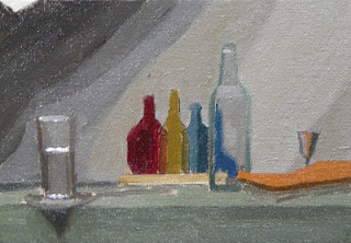
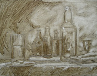
Heres the wipeout (linen,11"x14") and poster study (canvas board, 5"x7") for a new set up. Originally I had planned to do a colored ebauche (underpainting) over the wipeout, but I went back into this wipeout a little more than usual because of the complexity of the arrangement, so I'm thinking I might just windowshade without the ebauche since I can use the poster to gauge my colors. I'm also worried as to how long I have before those carrots start to look brown.
I'm using a new lighting setup. I have two four foot GE sunshine bulbs over my easel and a compact flourescent daylight bulb pointed at the still life. I'm liking the way the colors look under the easel but I would like to get a little more intensity and warmth onto the still life. An artist who's work I greatly admire informed me that he uses a homemade fixture that holds five compact flourescents with most of the bulbs rated at 6500. He gave me a link to a similar bulb lamp at B&H photo, but I think I will try to build one myself. Why all this playing around with the lights? I'm trying to develope some paintings with a softer more delicate lighting similar to what I experienced when I did some daylight paintings last summer. Ideally, I would use north light, but the window in my studio is west and most of the time that I have to paint is at night so I want to set up conditions that are more reliable.

Sunday, March 28, 2010

Lion Cast


This is the poster study and the ebauche for a new cast painting that I've started at GCA. I decided to use a rubbing in technique on this one rather than a wipe out or a thinned down full color stain. I'm only part way through the ebauche because I only had three hours and it took me a while to complete the poster (5"x7") .The actual painting is 11"x14" my largest one to date. The cool thing is that since I've done quite a few of these now I'm being given a little latitude so I'm approaching it more like a still life . Most cast paintings don't bother too much with the background. The poster actually has areas of pure white in it which shows the limitations of pigment and digital photography. I'm going through a lot of experimentation with the lighting setup in my studio and I'm getting good results which I'll post here in the near future. I wish I knew where this lion came from I haven't had any luck matching the image.

Thursday, March 25, 2010

More Apples

It's taken me a while to get back to those apples, fortunately they haven't completely rotted. In fact, they've developed a wonderful patina of colors that I've been working hard to try and capture. This paintings been a bit of an experiment as I've been trying out different lighting setups. My normal arrangement is to shine a spotlight on the still life while my easel is placed under two four foot long flourescent bulbs. One cool (bluish) and one warm (pinkish), This time I decided to try working under the same light as the still life so that I could match the colors exactly. Using a spot light on the easel proved to be too glaring so I went back under the flourescents but I added a 25 watt candescent clip-on lamp. I like the way the colors look on the easel, but I'm not sure that that's the way they would be lit in a gallery setting or home. It's not that I've been unhappy with the way that my paintings have been coming out, it's just that I've been reading a lot of munsell based color theory lately and it's got me questioning some of my basic assumptions. For instance, in this painting I was thinking a lot more about chroma than usual and I used some neutral value mixtures to lower the chroma rather than earth colors which is my usual way. The other problem is photographing the work. When I work under the flourescents the photos come out great but when I use the incandescent and then photograph using the flourescents alone, horrible. This photo was taken using the light that I was working under(flourescents and incandescent) and the colors look pretty close but I'm getting glare. I'll figure it out eventually. One thing that I'm realizing is that the painting and still life don't necessarily have to be made under the same light, the painting just has to match what I'm seeing, however it's lit. I'll see how things work out when I'm all finished.

Sunday, March 21, 2010

Exhibition


Here are some pics from an exhibit at the Smithtown Arts Council Mills Pond House gallery.(stacarts.org) The pictures are a little dark, I din't want to use a flash, but I thought it would be nice to show them framed and hanging on the wall. I asked my wife to pose in front of them to give a sense of scale. She was complaining and din't want to smile so I had to shoot quick, hence the blurryness. She thought that I should be the one posing but I didn't really feel like doing it either. I was going incognito. I didn't want anyone to know I was the artist so that I could hang out near the paintings and eavesdrop on peoples comments.(mostly good!)
I haven't been able to do much painting this week as I was going through a blackout. No power or heat from Saturday to mid day wednesday. I actually looked forward to going to work each morning just to get a chance to warm up. Everything's back to normal now and I am looking forward to getting back into the studio today and posting some new work pics.

Wednesday, March 10, 2010

Apples Ebauche

This is the ebauche underpainting for a small, 9"x12" oil on linen. I did a wipe out using W&N Greenish raw umber, and then after it was dry I did the color. I like to keep my ebauche kind of rough and basic. I know some artists, Tony Ryder, is one, like a very detailed underpainting. I like to keep that funky, abstract energy right up until the moment that I'm ready to start windowshading in full detail because I feel that some of that carries over into the tighter painting, which can look a little staid if you're not careful.
I've been spending the last few studio sessions putting together the Munsell student handbook. It comes with about 300 of these little squares that you have to organize by hue, value and chroma, and then paste down. It took me a little longer because I came up with the idea of cutting out the horizontal sections between the rows so that I could site through the chips and make color comparisons. It's a pretty good exercise in training yourself to spot subtle color differences. One of the things that I noticed is that a color will often look lighter than it's actual value if it's at a high chroma. That's good news for us fruit painters because nothing kills a painting quicker than overdoing the lights with the addition of too much white.